
New York City’s subway system just got a major update — and it’s turning heads. For the first time in decades, the Metropolitan Transportation Authority (MTA) has launched a completely redesigned map of the city’s famous subway network.
What’s New About the Subway Map?
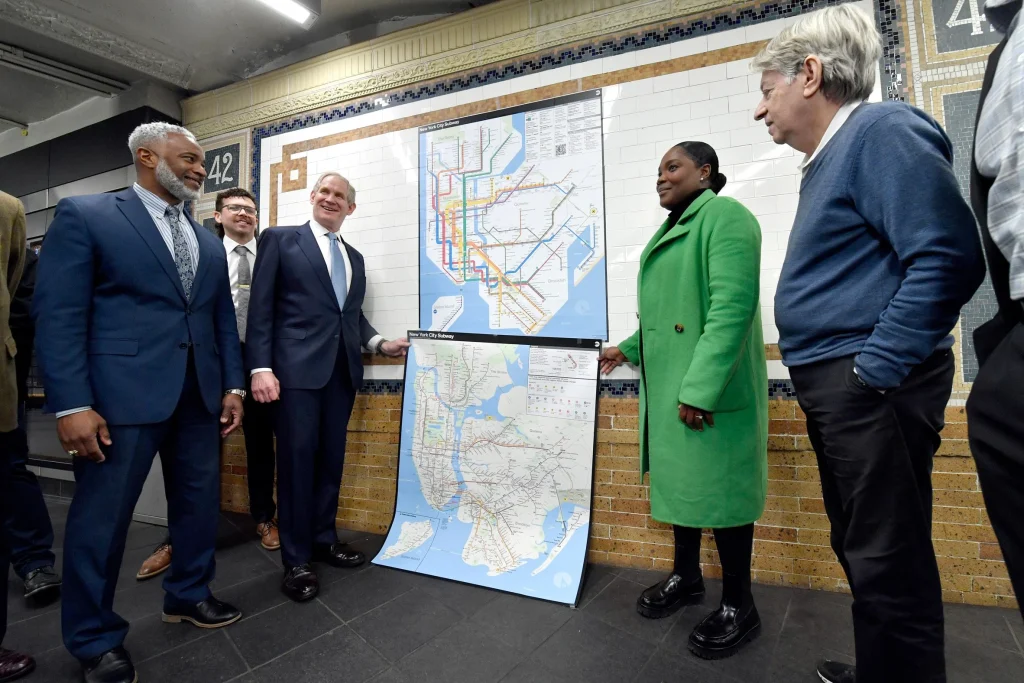
Unveiled on April 2, the new map is designed to guide the 3.6 million daily riders more easily through the complex system. While the familiar colors for each subway line remain unchanged, the overall look is much sleeker and more modern.
Think clean lines, bold colors, and simple geometric shapes. The map not only shows subway lines but also includes selected bus and ferry routes, plus some commuter trains — giving riders a broader view of the city’s transit options.
Designed for Today’s Riders
The redesign was crafted by the MTA’s in-house Creative Services Mapping Department. Their goal? Make the map easier to read for everyone.
The MTA highlighted that the new map follows a “diagrammatic style,” which is used by many big subway systems around the world. It features:
- Bold, straight lines for clarity
- A white background with vibrant colors
- Black dots marking stations
- Horizontal text for easier reading
This new style is especially helpful for people with visual impairments or cognitive challenges, making it more accessible and ADA-friendly.
Where Will You See the New Map?
The MTA is rolling out the updated map across the entire system — in train cars, on station walls, and online. Plus, the digital version is more interactive, showing live updates with trains moving in real time along their routes.
A Modern Take on a Classic Design
The new map replaces the version designed by Michael Hertz Associates in 1979. That map had a more geographically accurate look but was often criticized for being difficult to follow.
Interestingly, many have noticed that the 2025 design echoes the famous 1972 map created by legendary designers Massimo Vignelli and Joan Charysyn. That design was beloved by many designers for its clean, geometric precision but wasn’t always user-friendly for the general public.
Mixed Reactions from New Yorkers
As with anything new in NYC, opinions are flying. Garrett Corcoran, design director at local firm Order, called the map a “lightning rod” for public feedback but praised its clarity.
“When it comes to a transportation map, clarity is everything,” Corcoran explained. “While the old map was more geographically precise, this new version really focuses on helping people make quick, confident decisions during their travels.”
Staying True to New York’s Identity
Michael Bierut, a well-known graphic designer and partner at Pentagram (and a former collaborator with Vignelli), also weighed in. He believes the updated map strikes the right balance.
“This version solves some of the usability issues people had with the old designs, while staying true to that bold, geometric style that feels very ‘New York,’” Bierut said. “It’s anything but generic — it’s tough, smart, and beautiful.”
Rolling Out in Phases
Digital versions of the map are already live, and physical copies are being installed across stations. The MTA has also released specialized maps for late-night and winter service, keeping riders informed through every season.
More Tech Upgrades on the Way
Along with the map update, new digital screens are being added in stations. These screens don’t just tell you when the next train is coming—they now also show arrows indicating which side of the platform the train will arrive on, a much-needed feature for busy commuters.
What Else Is Happening in NYC Transit?
The city is also working on cutting down the amount of scaffolding cluttering the streets, and there’s buzz around a new proposal to renovate Penn Station, bringing back design elements from its original neoclassical architecture.
Why This Matters
Updating the subway map might seem like a small change, but for millions of people navigating the city every day, it’s a big deal. The clearer design helps locals and visitors alike get where they’re going faster — and with less stress.
So next time you’re riding the subway, take a moment to check out the new map. Whether you love it or have your own opinions, one thing’s for sure: it’s making waves in New York.


Leave a Reply